BookWorm Tutoring
May - August 2026
A tutoring platform for parents to easily manage their child’s extra tuition classes

Introduction
This was a self-initiated, conceptual project to demonstrate my UX design process.
My Role
As the sole UX designer on this self-initiated project, I was responsible for the end-to-end design process from identifying the problem to creating high-fidelity prototypes.
Responsibilities
• Researching and synthesizing research into user insights
• Wireframing
• Lo-fi Prototyping
• Mockup Designs
• Hi-fi Prototyping
Timeline
May 2026-Present
Status
Parent interface is complete
The Challenge
Parents require trustworthy and efficient apps that allow them to book reliable tutors for their children. While there are numerous platforms where parents can access tutoring services, these platforms are not always efficient for parents who are juggling busy schedules and time-constraints
Goal
The goal is to design a mobile app that enables parents (the users) to quickly discover, evaluate, and book qualified tutors while also allowing parents to glance at their child’s schedule and easily view feedback on their progress.
Tools Used
Figma
Mobbin
Dribble
Understanding the Problem
The project began by defining the problem from the perspective of parents, who are the primary users of the tutoring app. Parents often struggle to find trustworthy tutors, compare options, schedule lessons, and maintain clear communication throughout the tutoring journey.
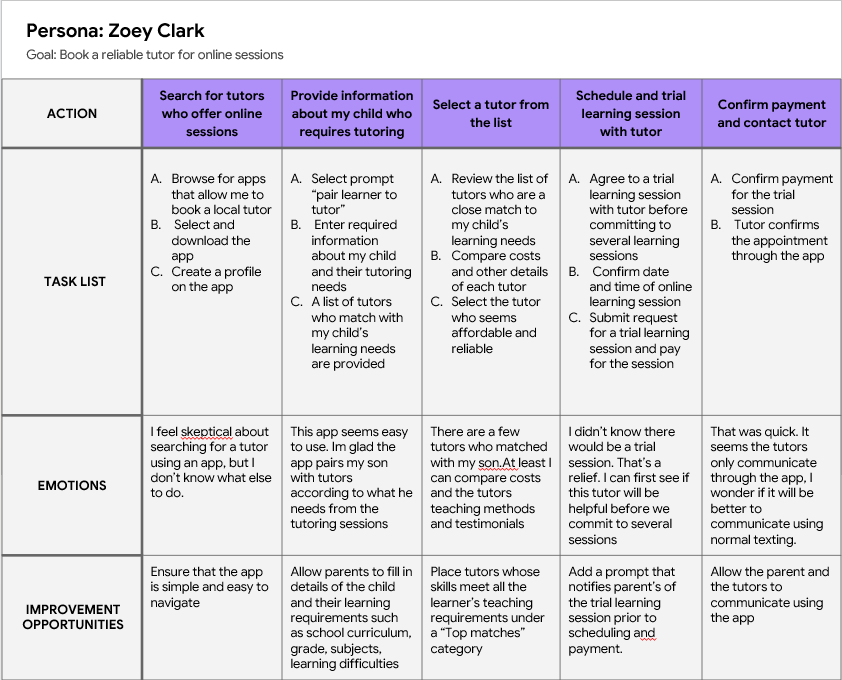
To better understand these challenges, I created user stories and user personas that captured users' goals and motivations. These helped me focus on what parents needed to accomplish rather than jumping straight into designing screens.
I then developed user journey maps to visualize the end-to-end experience of finding, booking, and communicating with a tutor. Mapping the journey helped identify pain points, moments of uncertainty, and opportunities to improve the overall experience.
Using these insights, I wrote a clear problem statement that guided the rest of the design process: Parents require trustworthy and efficient platforms that allow them to book the qualified tutors for their child’s academic needs.
Design Process
Ideation
With a clear understanding of the problem, I explored how the app could best meet users' needs.
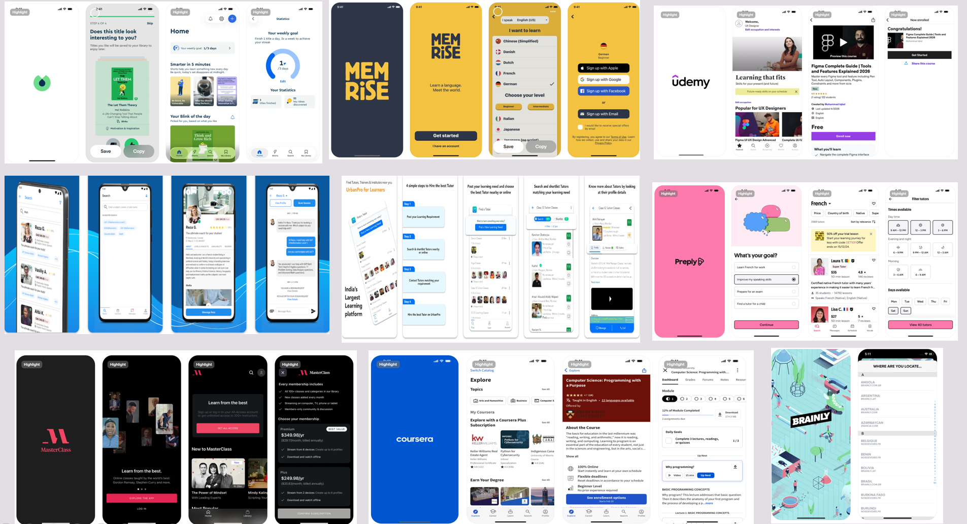
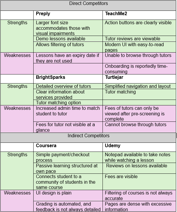
I conducted competitor audits of existing tutoring and education platforms to understand common features, identify strengths and weaknesses, and uncover opportunities. Rather than replicating existing products, I evaluated what worked well and where the user experience could be improved.
Based on this research, I identified the app's core features, including:
Browsing tutor profiles
Searching and filtering tutors
Booking tutoring sessions
In-app messaging between parents and tutors
Viewing schedule of upcoming lessons
These features were prioritized because they addressed the key needs identified during the empathy and research phase.
Exploring and Designing Solutions
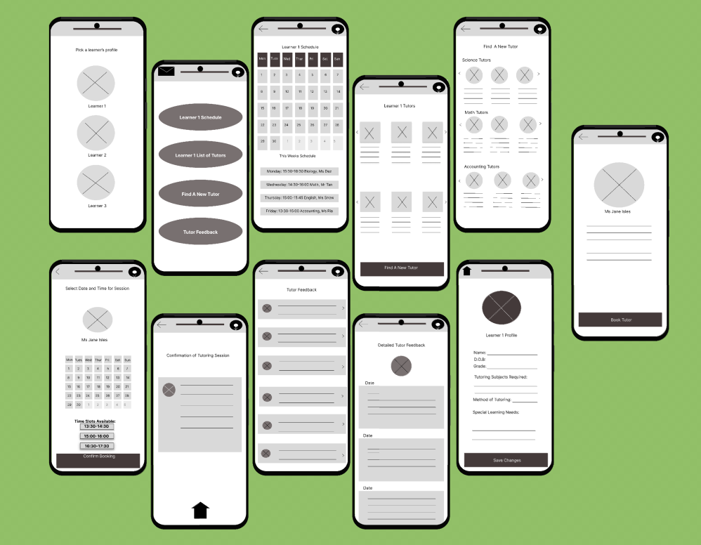
I began translating ideas into interface concepts through paper wireframes. Sketching multiple layouts allowed me to quickly explore different solutions before investing time in digital designs.
Next, I created low-fidelity prototypes to establish the information architecture, user flows, and screen layouts. At this stage, the focus was on functionality and usability rather than visual design.
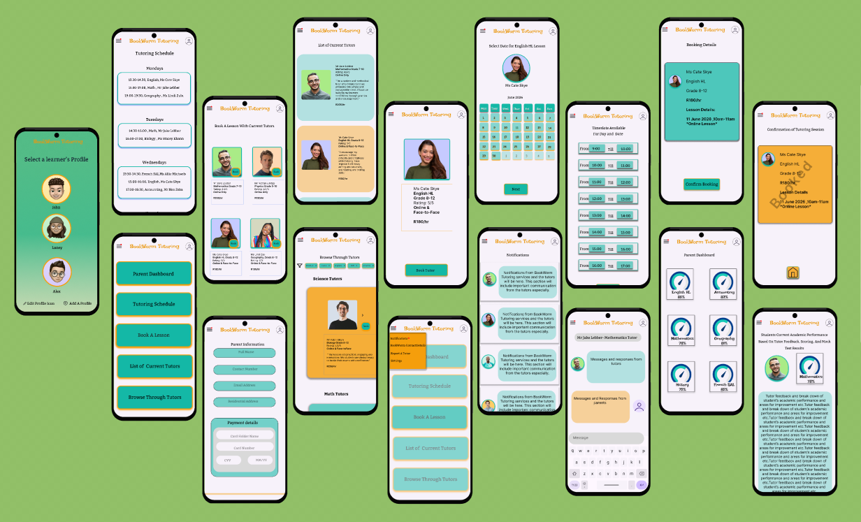
After validating the structure of the experience, I developed high-fidelity prototypes that incorporated visual design, branding, typography, colour, and interactive elements. The final prototype demonstrated a seamless experience that enables parents to discover tutors, book sessions, and communicate with confidence through a single, intuitive platform.
User research
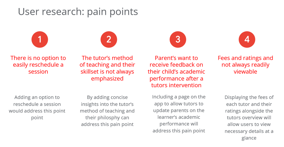
Since this was a concept project and I did not have access to real users, I conducted my research by analyzing existing tutoring apps and websites and reviews by countless users.
Key insights from my research revealed that users of tutoring platforms:
• Preferred apps that allowed for the rescheduling of lessons
• Benefited from having flexibility between face-to-face and online tutoring options
• Requested “parent dashboard” for feedback on their child’s academic performance
• Parents preferred to see a brief overview of the tutor’s approach to teaching
• Found it helpful to see the fee each tutor charges before confirming a booking.
Competitors Analysis
I conducted a competitor analysis of other tutoring apps (direct competitors) and educational apps (indirect competitors) to compare various elements and determine which are important for an efficient and happy user journey. Furthermore, I observed limitations in competitors and used this information to create an opportunity to streamline the user experience further.
UX Goal
Create a user-centered experience that reduces the time and effort parents invest in managing their child’s tutoring experience.
What space does this app create for users?
· Allows user to browse through tutors who meet the learning requirements of their child
· Book lessons efficiently
· See overviews of tutors teaching style and philosophy
· View tutor ratings
· Receive feedback on their child’s progress
· Message tutors on a secure platform
· Allow users (parents) to report tutors for poor conduct or behaviour
· View their child’s schedule for the week
Usability Interview Questions
As this was a conceptual project I did not use real users. However, if this was a live project these are the key usability questions I would seek to have answered through the usability tests:
· Can users complete the primary task of booking a tutor without any assistance?
· Are there any parts of the interface which cause confusion or hesitance for the users?
· Do users understand the overall navigation through the app?
· Are the icons and call to action buttons clear?
· What is the user's overall satisfaction with the browsing and booking process, and confirmation feedback?
· How do users feel about the aesthetics and feel of the app?
Visual design
The visual design was created with simplicity and usability in mind. Since parents are the primary users, the interface was designed to be approachable, easy to navigate, allowing them to complete tasks with minimal effort.
The interface follows a minimalist approach, using concise labels and clear calls to action. This makes it easy for parents to understand the next step at a glance, reducing the cognitive load which helps users to move through key tasks efficiently.
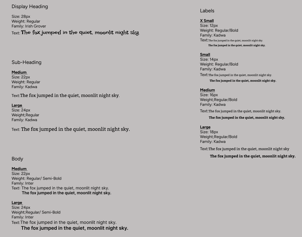
Text were kept to a minimum, with exception to the parent dashboard and notification sections. The typography was selected to continue with the minimalist, yet fun, design of the app.
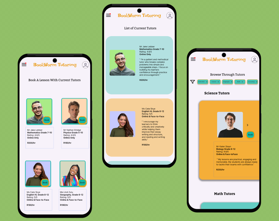
Book A Tutor
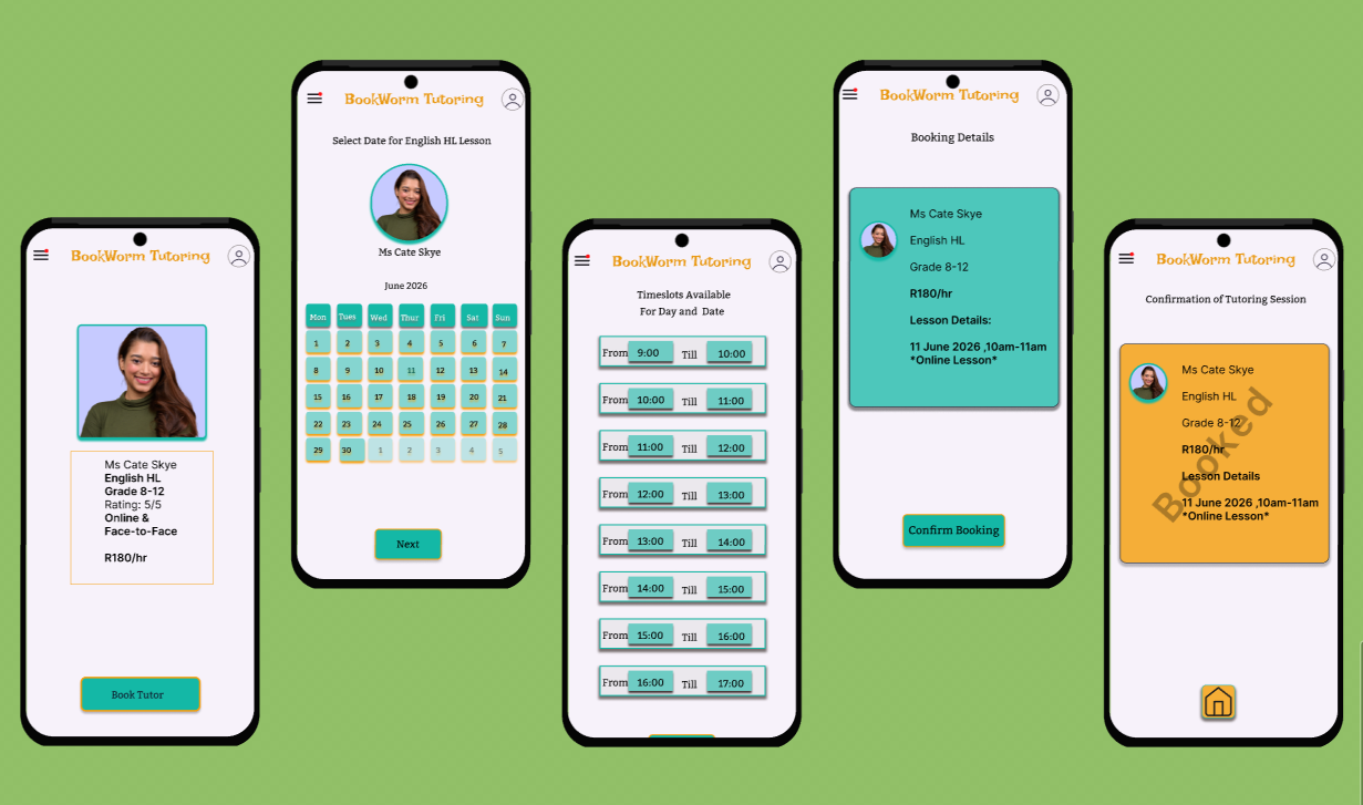
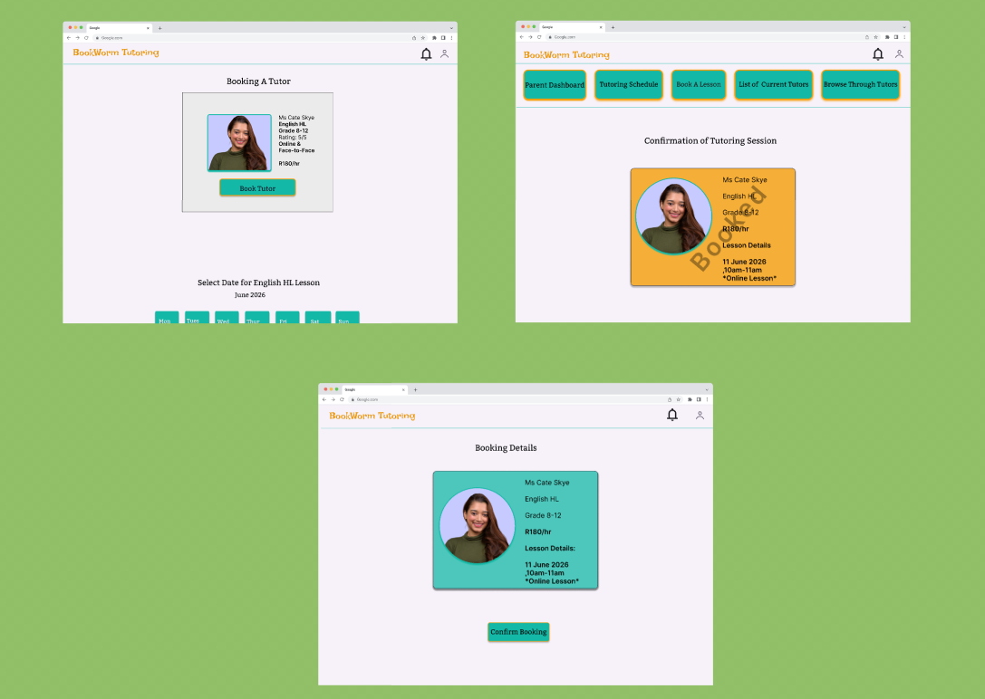
Designed a step-by-step booking flow to minimize cognitive load and user drop-offs
Prioritized vital tutor information before the booking process and confirmation
Actions to book a tutor are minimal, with unnecessary information and decision-making being reduced
Clear booking confirmation screen
Focal on creating a seamless, intuitive experience that allows busy parents to arrange for a tutor quickly
Browse Tutors
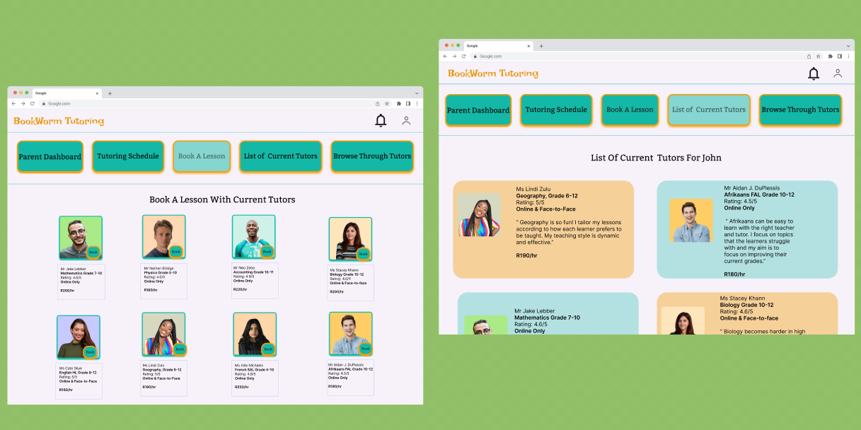
Tutor profiles were organized using a clear hierarchy for easy tutor comparison
Filtering options added for easier browsing
Tutor teaching approach/philosophy is displayed to improve trust and credibility
Profile information kept minimal with only core details necessary for booking a tutor being displayed
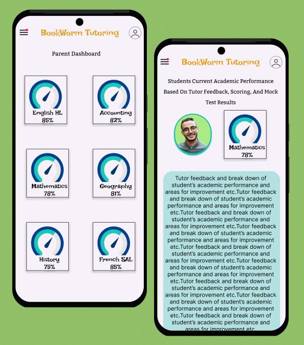
Parent Dashboard
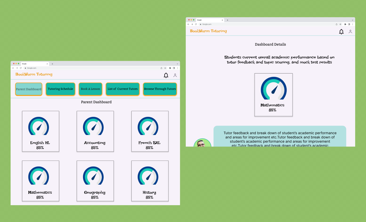
Created a dashboard where parents can monitor their child’s progress with current tutors
Tutor feedback and child’s mock test results are highlighted in one place
Simple visuals and organized hierarchy improves readability
This feature ensures parents stay up-to date with their child’s progress
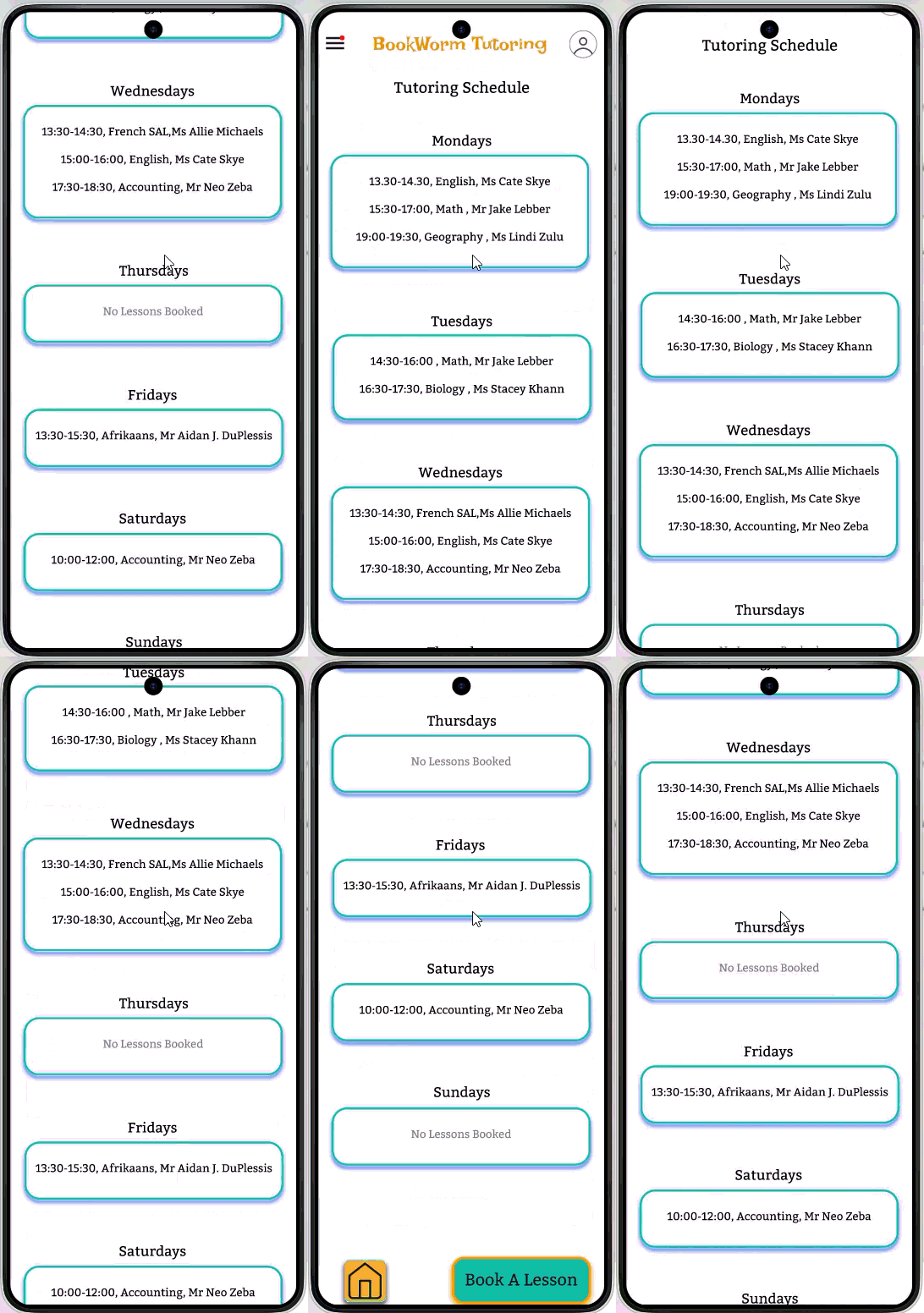
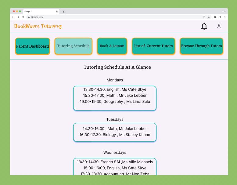
Tutoring Schedule
Weekly calendar displays upcoming sessions
Designed to allow parents to view their child’s schedule at a glance
Creates consistency between scheduling and booking experiences
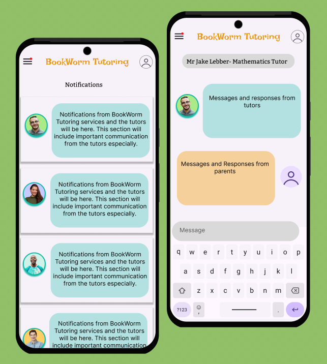
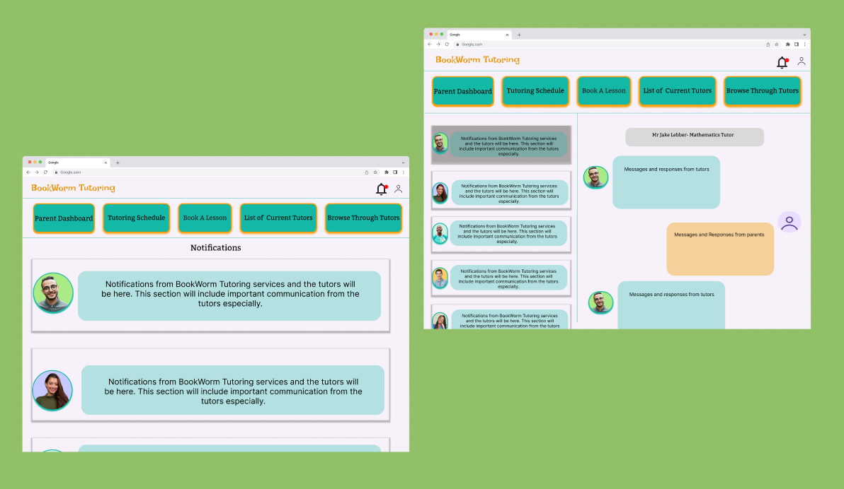
Notifications & Communication
Connects parents and tutors, and parents to the tutoring institution.
Creates an opportunity to keep communication professional and confidential without the need to share personal contact details
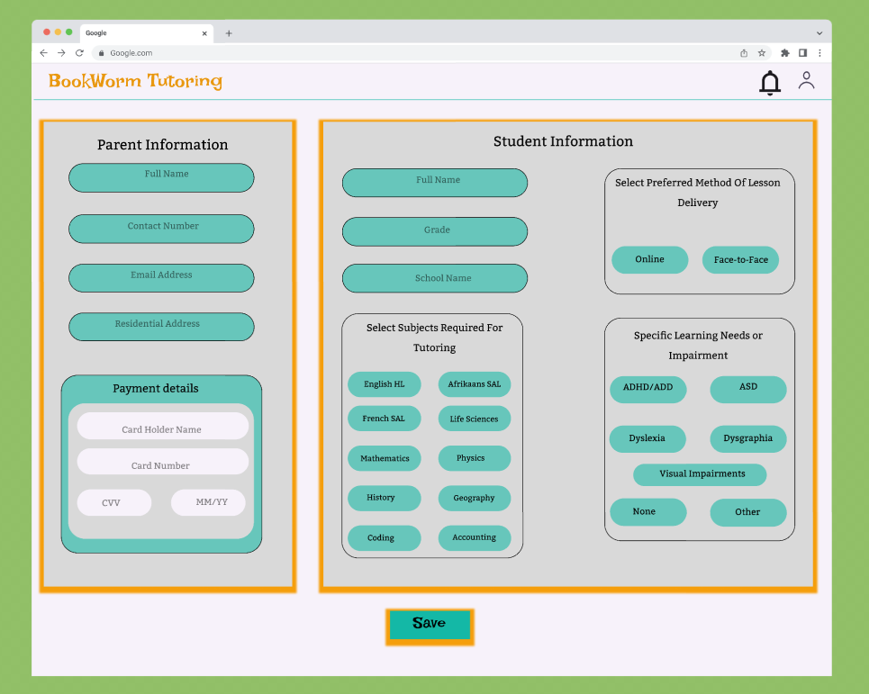
Profile
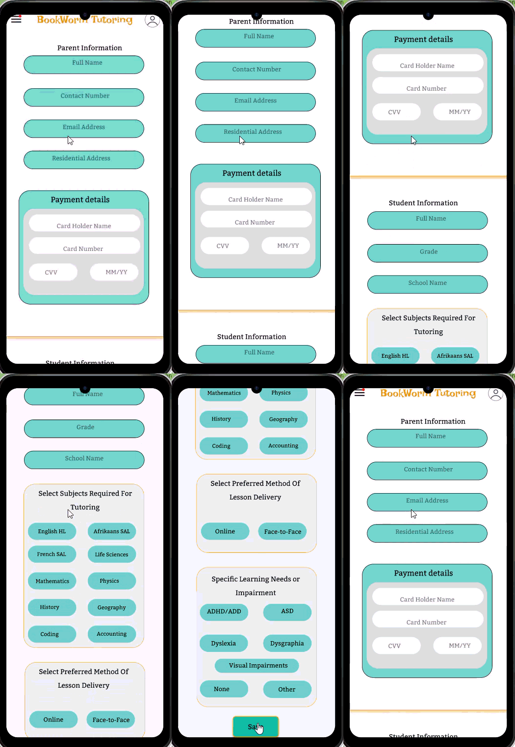
Allows parents to enter their details, payment information and their child’s details
Provides options to select tutoring method, subjects required and special learning needs of the child
Details will be used to provide a filtered list of tutors that match the leaner’s needs
Reduces overload of tutors available to browse through
Improves personalized learning support
Key User Flows- Mobile App
Introduction
After designing the mobile application, the next step was to create a desktop experience that supported the same core user needs while making better use of a larger screen. Rather than treating the desktop version as a completely new product, I approached it as an extension of the existing mobile experience. My goal was to create a seamless transition between devices so that users could immediately feel comfortable navigating the platform.
The Challenge
The challenge was to adapt a mobile-first interface to desktop without losing the simplicity that made the app easy to use. A larger screen provides more space, but it can also introduce unnecessary complexity if additional content or navigation is added without purpose. The objective was to use the extra screen space to improve clarity and efficiency while maintaining a familiar experience for returning users.
Goal
The goal was also to keep the desktop interface closely aligned with the mobile application. Maintaining the same navigation structure, visual hierarchy, and interaction patterns meant users wouldn't have to learn a new interface when switching devices.
Responsive Desktop Design
Outcome
The final desktop experience feels like a natural continuation of the mobile application rather than a separate product. By preserving familiar navigation and interaction patterns while improving layout and readability, the design offers a seamless cross-platform experience.
Parents can efficiently manage tutoring schedules, monitor their child's progress, discover tutors, and make bookings within an interface that is both familiar and easy to navigate. The result is a desktop experience that balances consistency, usability, and clarity while making effective use of the additional screen space.
Responsive Design
Book A Tutor
Browse Tutors
Parent Dashboard
Tutoring Schedule
Notifications & Communication
Profile
Reflection
This project reinforced the importance of grounding design decisions in user needs. By starting with empathy, defining a clear problem, researching existing solutions, and iteratively refining the interface from sketches to high-fidelity prototypes, I created a user-centered solution that simplifies the process of finding and managing tutoring services for parents.
Furthermore, this project taught me how to design across platforms with consistency. I learned that extending an experience is not about adding more functionality but about adapting existing interactions to suit a different context.
By prioritizing familiarity, visual hierarchy, and simplicity, I was able to create a desktop interface that enhances the overall user experience while remaining true to the design principles established in the mobile application