Joe-Joe’s Autobody
Aug-Sep 2026
A refined & user-friendly website for a premium autobody business
* Confidentiality NoteTo respect the client’s privacy, the business name, logo, images and other identifying details have been altered for this case study. “Joe-Joe's Autobody” and the logo are fictional for portfolio purposes. The UX challenge, process, and design work are based on a real client project.Introduction
This project was a proposed website concept for an autobody business. This project explored how the business could establish a professional and premium online presence while making key information easy for customers to find.
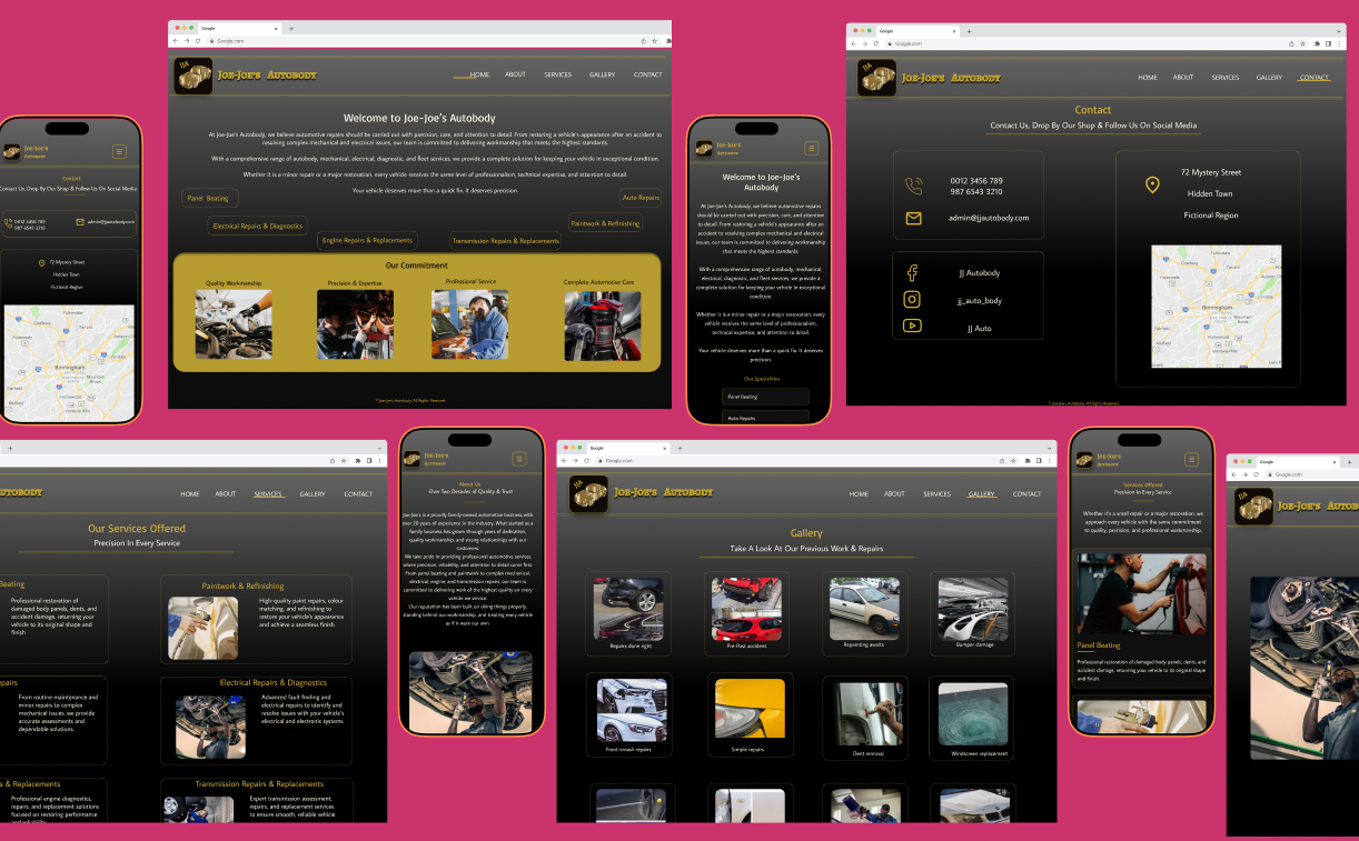
I designed a five-page website consisting of a Home page, About page, Services page, Gallery, and Contact page. The visual direction was built around the business's existing black-and-gold brand colours, with a clean typographic system and straightforward navigation.
The final design serves as a visual concept of how “Joe-Joe’s Autobody” could present it’s brand and services online.
My Role
· UX & UI Designer
o Wireframing
o Lo-fi prototyping
o Hi-fi prototyping
o Mock-ups
o UI design and visual direction
Timeline
August-September 2026
The Challenge
The website needed to represent the personality of the business while still being practical for its customers. The owners wanted the website to have a regal and luxurious feel, but I also wanted to make sure that the visual styling did not interfere with usability.
For an autobody business, visitors are likely looking for practical information quickly—such as:
What services are offered?
What does the business look like?
Can I see examples of previous work?
How can I contact the business?
What is the business about?
This meant the design needed to balance visual impact with clarity and ease of use.
Goal
The goal of this project was to create a website that felt professional, luxurious, and trustworthy, while keeping the experience simple and easy to navigate.
Tools Used
Figma
Dribbble
Mobbin
Research Summary
Competitor Analysis
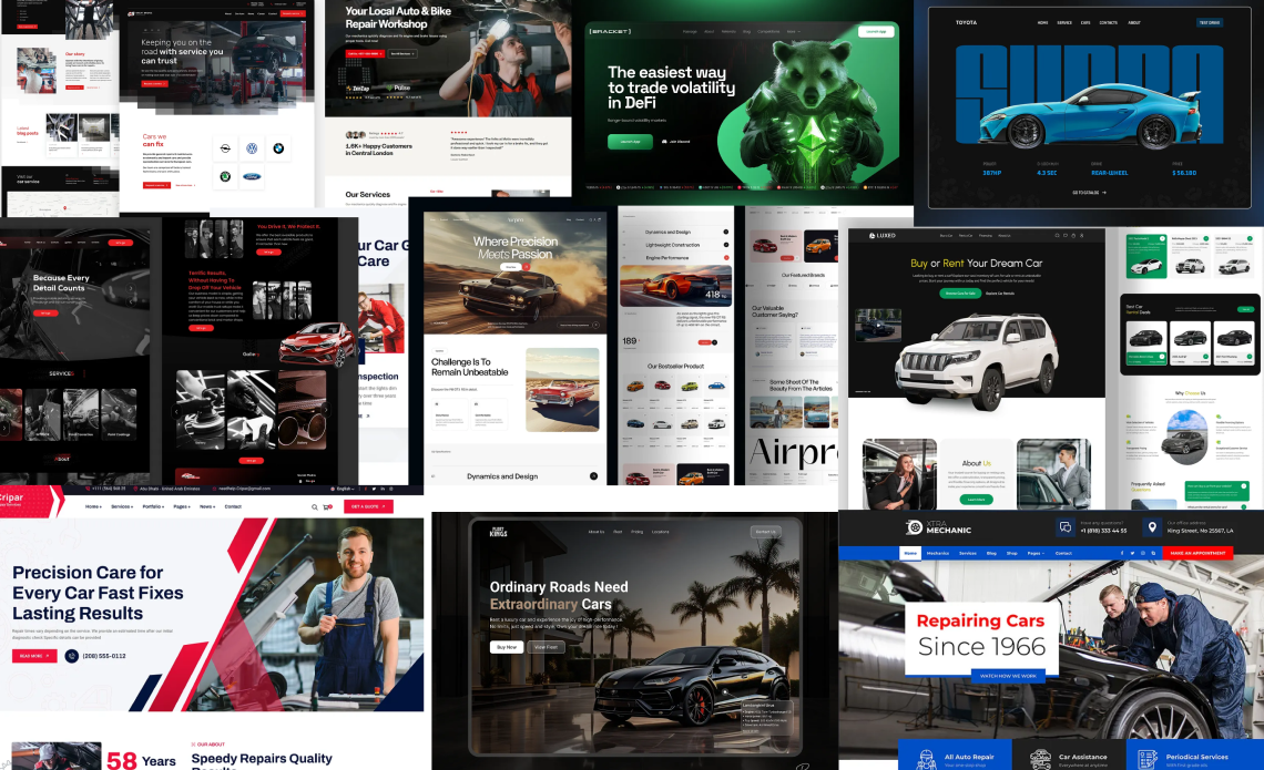
I conducted a competitor analysis of local autobody businesses to understand how they position themselves online and how their websites guide prospective customers.
I looked at factors such as visual presentation, content hierarchy, navigation, calls to action, services, and the overall customer journey. I identified both strengths and pain points across the different websites, paying particular attention to what helped build trust and what could make it difficult for a customer to take the next step.
These findings helped me identify opportunities for my client's website and informed key design decisions throughout the project. Rather than simply replicating what competitors were doing, I used the analysis to determine what worked, what was missing, and how the experience could be improved to better communicate the client's premium service and make it easier for customers to engage with the business.
Several common patterns emerged from the analysis:
Information overload: Some websites contained large amounts of information with limited visual hierarchy, making it difficult to quickly find relevant information.
Limited visual proof: Some businesses did not showcase examples of their previous work, missing an opportunity to demonstrate the quality of their services and build customer confidence.
Similar visual identities: Many competitors used familiar website structures and predominantly white-based colour palettes, often paired with red. While these layouts were effective and familiar, the overall visual presentation of many sites felt quite similar.
An opportunity to differentiate: The client's black-and-gold brand identity was less common among competitors, providing an opportunity to create a more distinctive and premium visual experience.
The competitor analysis helped me identify where I could improve the experience without making the website unfamiliar to users.
I retained a conventional website structure with familiar pages such as Home, About, Services, Gallery, and Contact. I chose this approach because familiar navigation reduces the effort required to find information and allows customers of different levels of digital experience to navigate the site with confidence.
Rather than trying to differentiate the website through an unconventional layout, I focused on how the information was presented. I introduced clearer visual hierarchy, showcased examples of the client's work, and used the existing black-and-gold brand identity to create a more distinctive and premium feel.
This allowed the website to feel familiar and easy to navigate, while still standing apart from competitors visually.
Design Process
Ideation
The client wanted the website to communicate three key qualities: trust, quality, and a premium level of service. Their business takes pride in treating every vehicle with care, so the website needed to convey that same sense of professionalism and attention to detail from the moment a customer landed on the page.
To explore different ways of communicating this, I used Pinterest, Mobbin and Dribbble to research visuals, layouts, and design approaches from other autobody’s and premium service brands. Rather than simply replicating existing designs, I focused on identifying visual elements that could help create a sense of confidence and quality.
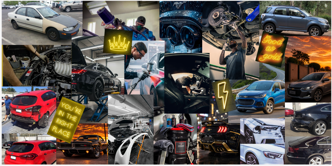
The existing brand identity was built around black and gold, so I carried these colours into the visual direction. Black provided a strong, sophisticated foundation, while gold was used as an accent to reinforce the premium positioning of the brand.
I also created mood boards to establish a consistent visual direction. I explored imagery, typography, colour, materials, and automotive photography that reflected the pride the client has in his business. This helped translate the client's vision of a high-end, trustworthy service into a more tangible design direction.
UI Mood Board
UX Mood Board
Information Architecture
I kept the website structure intentionally simple, with five core pages:
Home → About → Services → Gallery → Contact
This structure gives each major piece of information its own dedicated space while keeping the overall experience easy to understand.
The navigation was designed around the questions a potential customer might have when visiting the site:
Who are they? → What do they do? → What does their work look like? → How can I contact them?
This helped keep the website focused and prevented the navigation from becoming unnecessarily complicated.
Wireframes & Lo-Fi Prototype
I created paper wireframes to brainstorm several ideas for the layout of the app. After evaluating different concepts, I developed digital wireframes and further refined the designs. I then created a low-fidelity prototype to test the app’s functionality and user flow, allowing me to identify and address usability issues before moving on to the high-fidelity design.
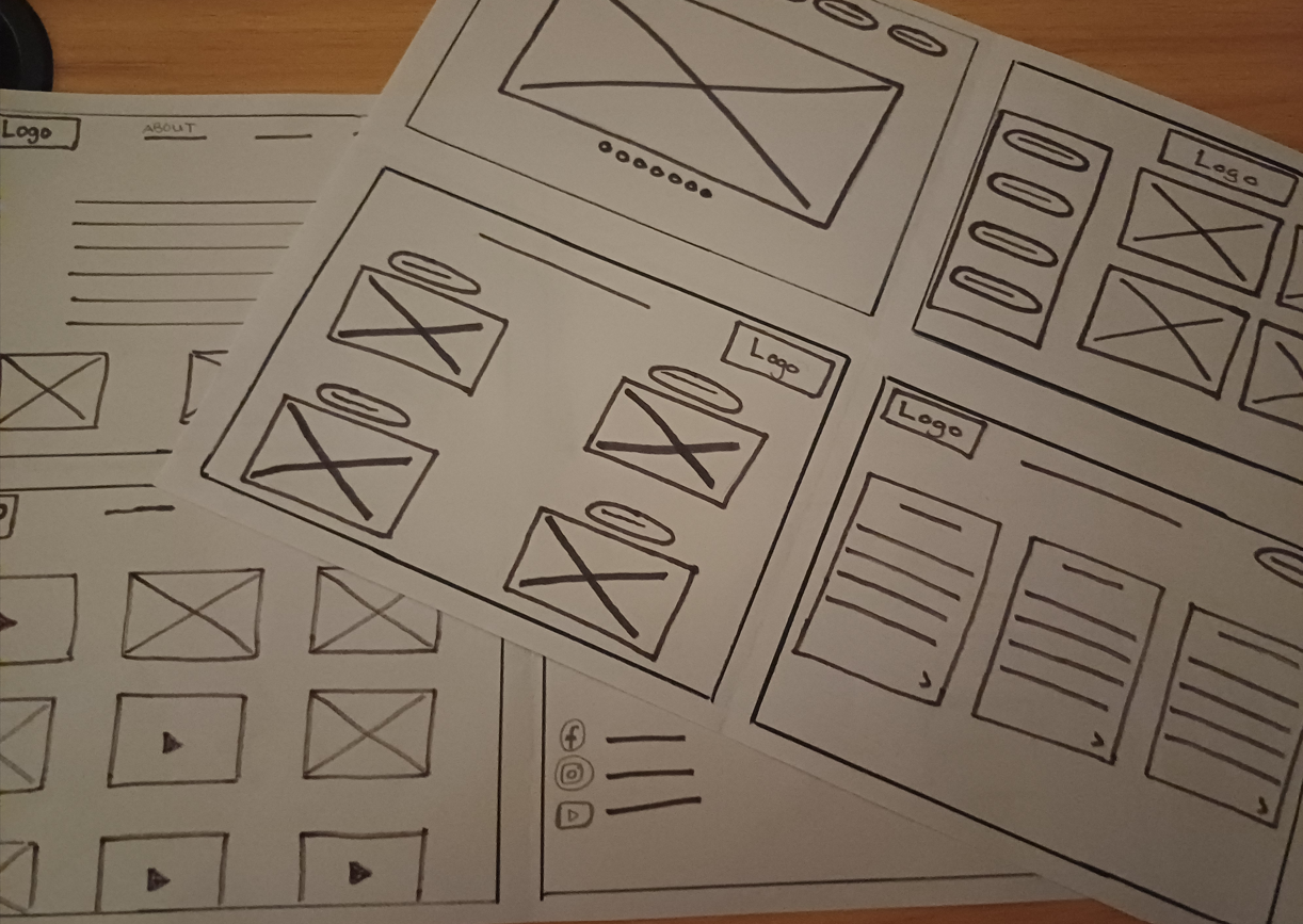
Paper Wireframes
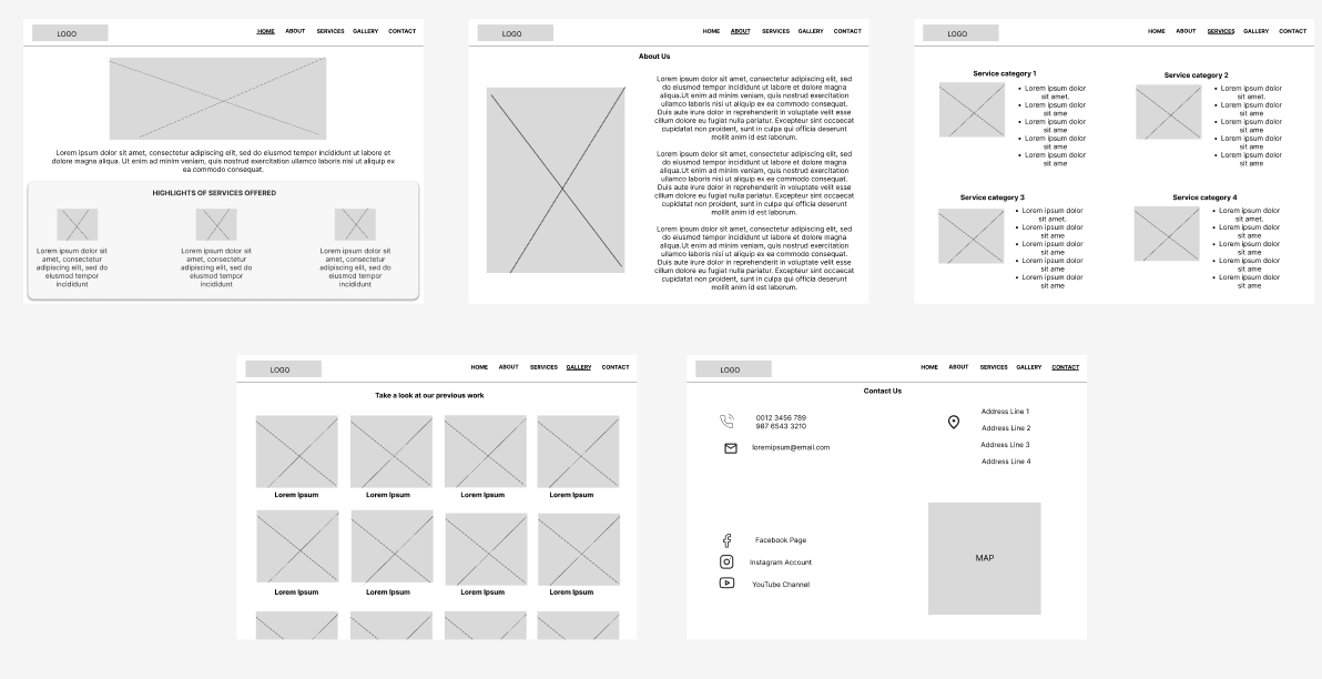
Lo-fi Design
Visual Direction & Typography
Visuals
The business already had a strong black-and-gold colour palette, so rather than introducing a completely new visual identity, I used the existing colours as the foundation for the website.
Black provided a strong, sophisticated base, while shades of gold was used as an accent to create a sense of luxury and premium quality.
The combination also helped reinforce the regal aesthetic requested by the owners.
Typography
I chose simple, clean fonts to complement the visual identity.
Because the colour palette and gold accents already provide a strong visual personality, I kept the typography relatively restrained.
This created a balance between luxury and readability rather than allowing decorative elements to overwhelm the content.
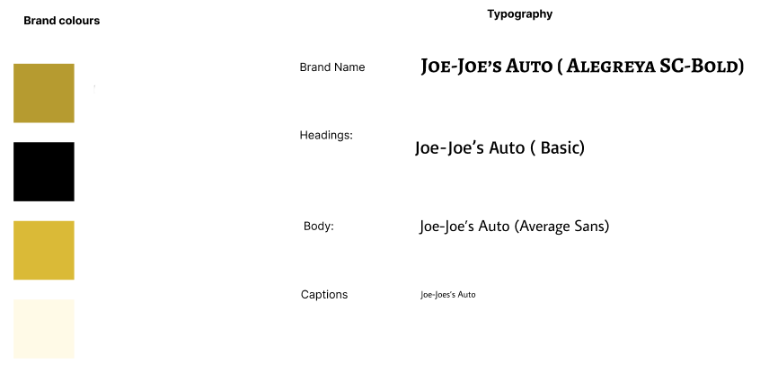
Page-by-page
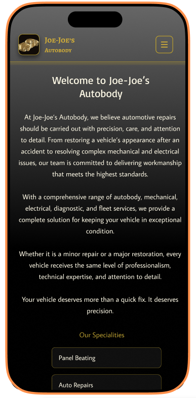
Home page
The Home page is the introduction to the business.
The design establishes the black-and-gold visual language immediately while directing visitors toward the most important areas of the website.
The goal was to give visitors a strong first impression while making it clear where they could go next.
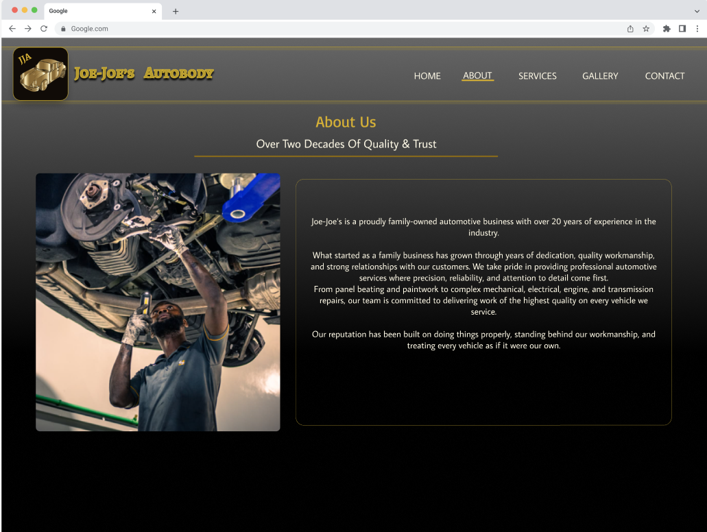
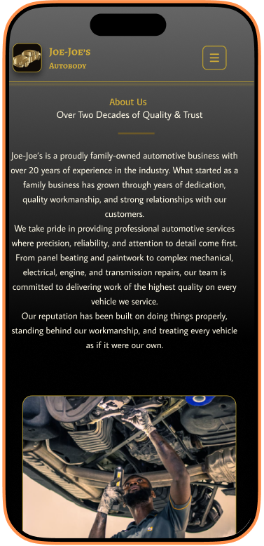
About page
The About page provides visitors with more information about Joe-Joe's Autobody.
This page helps establish the business's identity and gives visitors an opportunity to understand who they are trusting their vehicles with.
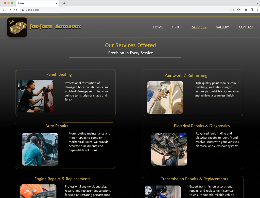
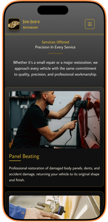
Services page
The Services page focuses on communicating what the business offers.
I designed this section to make the information easy to scan, allowing visitors to quickly identify the services relevant to their needs
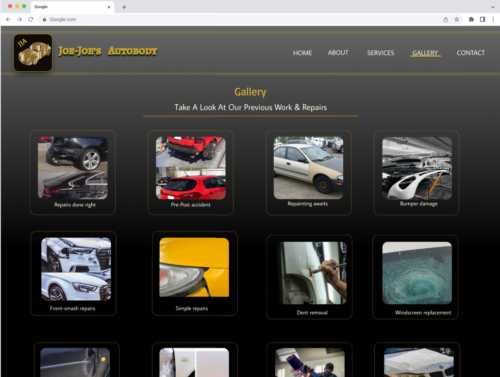
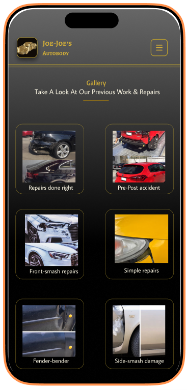
Gallery
The Gallery is a visual showcase of the business's work.
Rather than relying entirely on written descriptions, the gallery allows the work itself to communicate the quality and nature of the services provided.
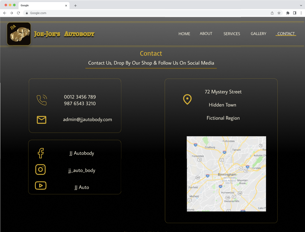
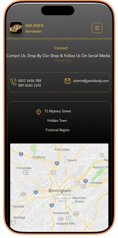
Contact page
The Contact page provides a clear pathway for visitors who want to make an enquiry.
The page was designed with simplicity in mind, keeping the focus on the information and actions required to contact the business.
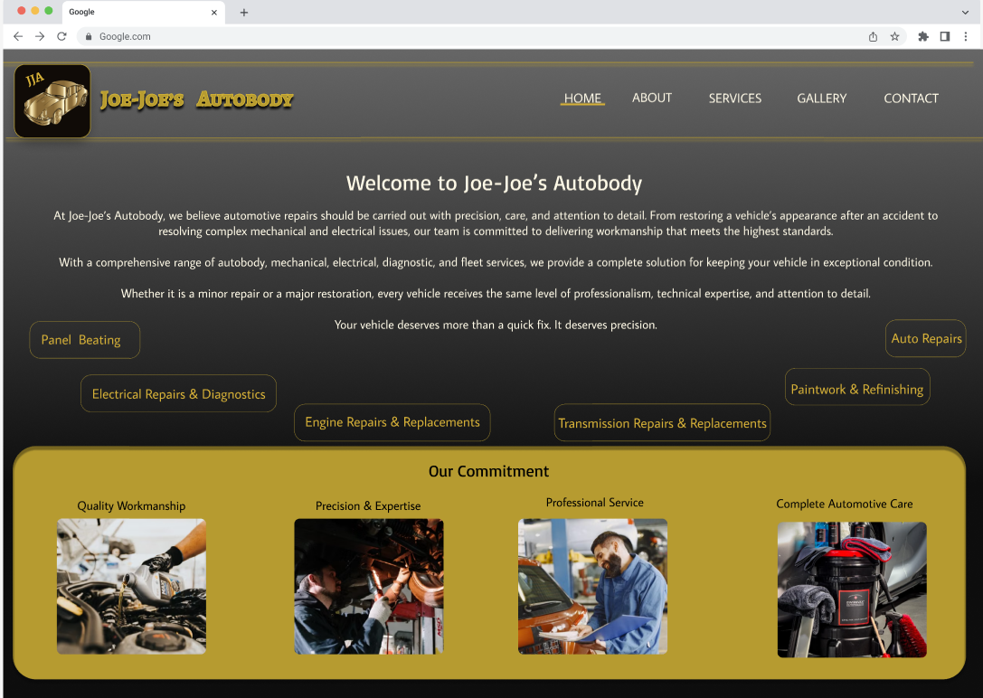
Final Design
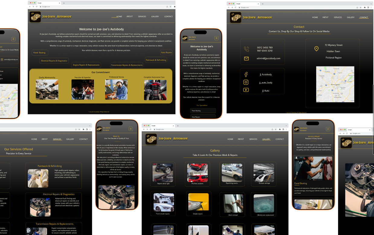
The final design combines the client's requested luxury aesthetic with a simple and straightforward website structure.
The black-and-gold colour palette creates a strong visual identity, while the restrained typography and clear navigation help maintain usability.
The result is a website that aims to feel premium without sacrificing simplicity.
Takeaways & Reflections
This project taught me that good UX doesn't always require a complicated interface or a large number of features.
One of my biggest takeaways was the importance of designing within the context of the client's goals.
The owners wanted a regal and luxurious website, so my challenge was not simply to make the website look attractive. I needed to translate that direction into a visual system while still keeping the experience straightforward for users.
I also learned that simplicity can be an intentional design decision. By keeping the navigation focused on five key sections, I was able to create a structure that is easy to understand without adding unnecessary complexity.
If I were to continue developing this project, I would like to validate some of my design decisions with real users.
Some areas I would explore include:
Conducting usability testing to see how easily users can find key information.
Gathering feedback on the visual balance between the luxury aesthetic and readability.
Reviewing the website across different screen sizes and devices.
Using analytics, if available, to understand how visitors interact with the site.
This would allow me to move beyond designing based on assumptions and use real user feedback to improve the experience.